STAGED TO SELL
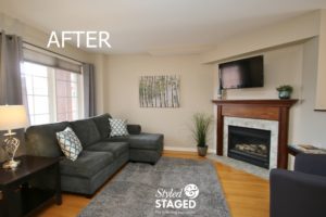
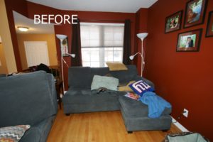
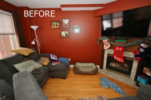
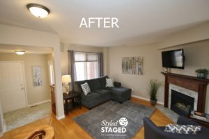
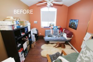
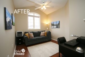
Our staging team last month did an extraordinary job transforming this home. Having the rooms painted made a significant difference in the results. Check out the before and after pictures below.
As our staging team walked into this house back in December, we knew it needed to be painted. The homeowners were very reluctant and it took some convincing that they would get their money back in the paint. We are happy that they decided to go ahead with it and hire professional painters to make sure the job was done right. These homeowners were amazing to work with. They did whatever we asked them to do and were more than willing to buy what we suggested. Once the painting was done, we were surprised how quickly we could turn it around.
Neutral Walls and Furniture Placement
The living room walls made the room feel small and dark and their U-shape sectional dominated the room. When homeowners get transferred around a lot for work, it can be challenging for them to know what furniture to buy, that will fit in other houses. We also felt that the TV dominated the room.
The neutral walls completely transformed the room. We needed more furniture for the office loft, so moving part of the sectional upstairs enhanced both rooms without costing anything, They also switched the large TV for a smaller one that they already had. We love the challenge of rearranging the furniture in different rooms to repurpose it.
Removing the white floor lamps with a stylish table lamp softened the room. Their new gray shag carpet is something that they will be able to use in their next house. It adds texture and expands the space making the room feel larger. Notice they even spray painted the brass around the fireplace with BBQ heat retardant paint.
We brought in large artwork to tie the whole main living space together. You are always better with fewer larger pieces than several small pictures for Stagings. Their new chair invited you into the room and created a welcoming space for conversation, not just TV.
Dining in Style
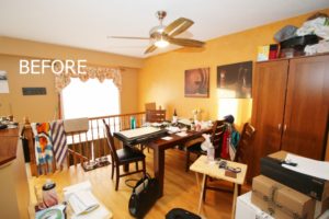
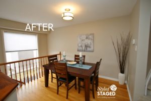
We were concerned about painting these gold walls since they were ragged with glaze and had texture. This could really scare off buyers. This is why we were so happy they hired professionals. They also had too much furniture in the room.
Once the large cabinet was removed, they were able to turn the table to the other direction. This made it mush easier to walk around. You only need a few large accessories to give some drama. Removing the valance from the window also updated the look.
Kitchen Cabinets
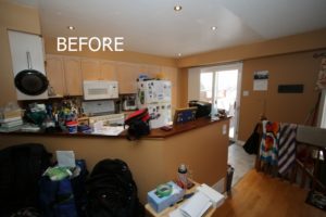
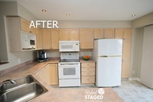
Replacing or even painting kitchen cabinets can be risky since you really don’t know what buyers are going to want and it’s an expensive task. It’s safer to just make them look their best. These cabinets are in perfect condition so it would be a shame to change them unnecessarily.
The new wall paint colour worked with the floor and neutralized the colour of the cabinets.
Tone it Down
The office/den room was a catch-all room and we really wanted to give it a purpose for resale. We moved this futon downstairs in the family room, removed all the storage bins, brought in a desk and continued the same paint colour upstairs.
Buyers can see this as a home office, a guest room or den. The homeowners’ had their father’s photography blown up as a surprise. We love it when you can still personal touches in a house.
Work With What You Have
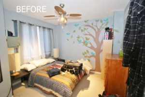
When our staging team walked in, this children’s room didn’t make sense to me. It had adult furniture but a youthful painted mural. This mural was here when they bought the house. They didn’t have any children but one of their relatives had a crib that they weren’t using.
Now, this room looks like an adorable nursery that might just be the selling feature. If buyers don’t like it, they can always paint over it but it was faster for us to just put in the crib, remove the other furniture and put up some white drapes to keep it looking fresh. The crib also makes the room feel larger than a queen size bed.
Master Bedroom Gets Some Drama
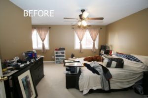
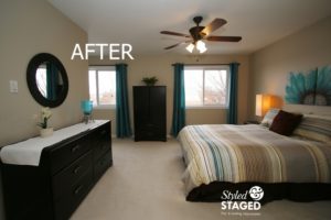
They were already starting to pack up some of their things. New drapes, linens and artwork were the biggest change in this room. They didn’t have a headboard but this canvas artwork creates the illusion of one and gives the bed some height. The matching lamps also give symmetry. The turquoise drape panels on both windows extend the colour to the far end of the room. A few simple accessories give the room atmosphere. The round shape of the mirror softens all the edges of the room.
THE RESULTS
 |
 |
|
|---|---|---|
| Views on Realtor.ca | Facebook Reach | Direct Emails to Buyers |
432 |
723 |
378 |
 |
 |
|
| Showings | Asking Price vs Sale Price | Days on Market |
24 |
97.7% |
17 |

