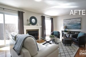
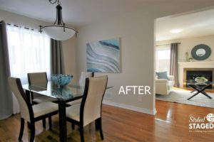
5 BIG CHANGES
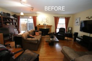
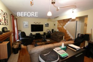
Every house has its own story. In this case, the family had outgrown the space and purchased a large country home that they were moving to right after we staged the house. The big decision was ‘what furniture do you keep for Staging purposes, and what do you pack in the moving truck to keep costs down? Each visit required more decisions to be made as we slowly removed old furniture and bought new furniture. Every time we went to the house it looked completely different and more decisions needed to be made.
-
New paint colour on the walls. Since they were painting the entire house, we painted large colour sample boards to make sure it was the right colour. It’s very hard to choose from a tiny swatch.
-
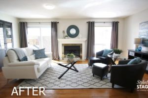
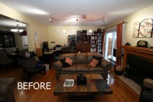
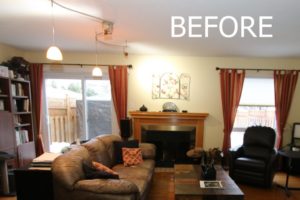
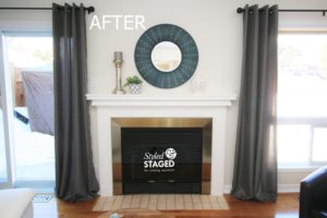
The oak fireplace was painted white which completely updated it.
-
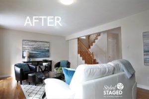
All new furniture was brought in to the living/dining room that they will eventually take to the new house.
-
The track lighting in the living room was replaced and a new pendant in the dining room was hung.
-
A balance was created in the rooms with drapes, accessories and new furniture placement.

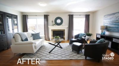
They decided that they wanted to buy new furniture for their new house, so we figured it would be best to have it delivered to this house. Fortunately, their new furniture looks amazing in this room. We brought in the drapes, artwork, lamp, area rug and ALL the accessories.
Remove What You Don’t Need:
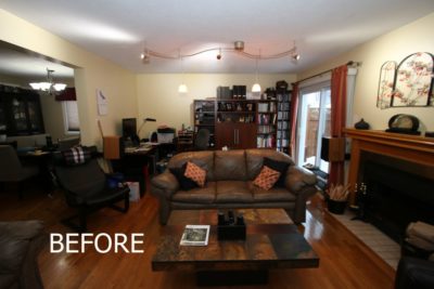

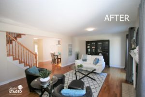
Their home office was removed and we brought in the wall unit that used to be in the dining room. This allows breathing space and easy access to the patio doors. Our team added the artwork and greenery to the far corner so there is a nice sight line from every angle in the room. It also draws your eyes to the artwork and not at the wall unit which makes the room appear wider. Notice how all the bright accessories in the wall unit keep it looking light and not dark.
Show Buyers How to Use the Space:

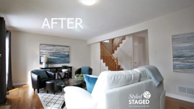
Although we no longer have a TV, buyers can easily see that there is lots of space for one. This furniture configuration shows lots of seating and it’s great for conversation.
Pull accessory colours from the artwork. In this case, the fireplace was the focal point as soon as you opened the front door. We love how the round blue mirror creates a bold statement and makes the house memorable. Since it has a matt finish, we added the shiny silver candlestick and white porcelain pots and greenery for interest and different textures.
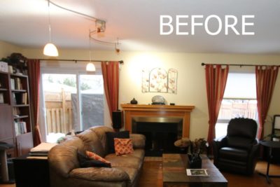
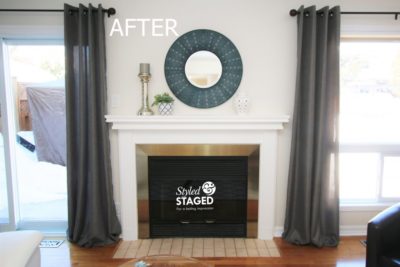
Balance is so important in photos. The patio door on the left is much wider than the window on the right so the fireplace was not centred between the two. We had to fix this! We extended the rod on the window as far as possible so the drape was more on the wall and closer to the fireplace. Now the space is even!
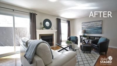
We originally put a grey area rug in the room but it looked too dark. Then we tried a solid beige one, but it looked yellow beside the ivory leather sofa. This ivory rug lightens the room and gives some visual dimension with the pattern. Ideally, it would have been a bit larger so the entire chair could sit on it, but it was our best option.
Adjoining Dining Room:
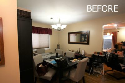
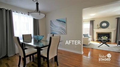
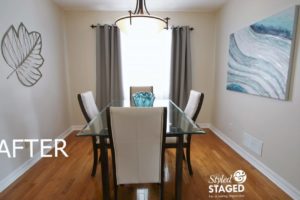
When the rooms flow from one to the other it’s really important to also have the same ‘feel’ in each room. Always notice how your sight lines look from each room.
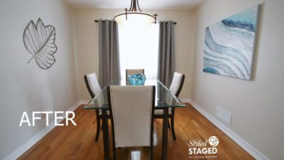
They installed a new light fixture and a curtain rod so we could remove the valance and roller blind. The blind was always down since there is a house close by. The white shears allow natural light to come in and the side drape panels match the ones in the living room for a continuous flow. They brought in this new table which will eventually be going to the new home. The glass table top keeps the room light and airy. Very happy for our sellers! This home sold for 100% of the asking price!
THE RESULTS
 |
 |
|
|---|---|---|
| Views on Realtor.ca | Facebook Reach | Direct Emails to Buyers |
521 |
672 |
432 |
 |
 |
|
| Showings | Asking Price vs Sale Price | Days on Market |
14 |
100% |
6 |

