STAGED FOR MULTIPLE BIDS
Open Up the Spaces
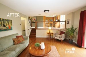
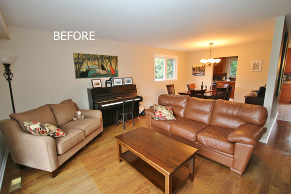
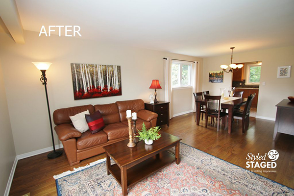
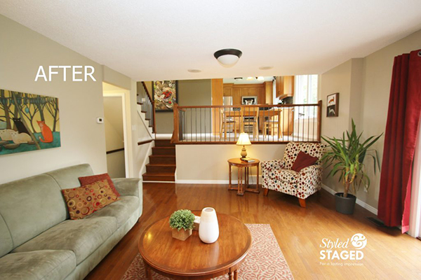
There was too much furniture in this room and the sofa completely blocked the entrance into the dining room. They needed a sofa for their other house so by removing the one love seat, we were able to move the sofa along the long wall and move the piano to the other side of the room.
The homeowner’s had this area rug in storage. It helped define the zones and brought in more colour. Styled & Staged brought in larger artwork, accessories, cushions and drapes for the dining room. The dining room window looks much larger with the drapes and it adds softness to that end of the room.
Create a Cozy Family Room
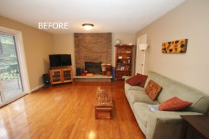
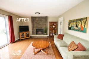
The homeowners also had this area rug in their storage so we thought it would warm up the room. We found this roundtable in their basement which widened the room. Use round tables to break up long narrow rooms. We love going through a house to see what can be used in different ways instead of buying new things. We used their ‘cat’ artwork that used to be in their formal living room here instead for a more casual look. I carried the colour through by adding the drapes on the patio door. It was a beautiful frame to their lovely garden. Adding the greenery by the fireplace softened all the brick.


Keep it Neutral
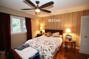
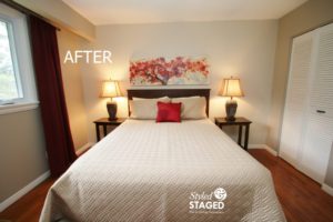
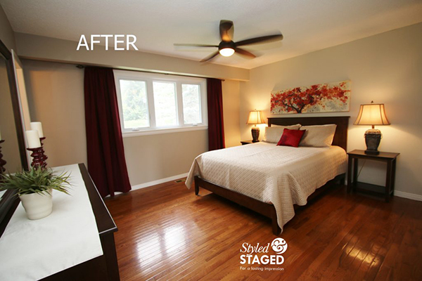
We were nervous about asking the homeowners to remove the wallpaper and then repaint their feature wall but for staging purposes, the striped wallpaper was too personal. Buyers like a move-in-ready house. We were able to find another end table that was similar to their existing one on the other side of the bed. Little changes can make a big difference. Doing this also allowed me to use the smaller round end table int he family since it went with their round coffee table. Styled & Staged brought in linens, artwork and accessories. We were able to use their drapes. The homeowners loved the finished product which makes their hard work easier to justify.

Draw Buyers into a Room
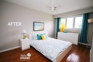
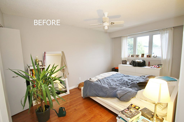
We prefer to see the bed as you enter the room since it gives a better photo, and remember, we are staging for the MLS photos to look their best. This room was a simple fix by bringing in linens, drapes for colour, accent cushions and artwork that tied everything together. Since this room already had a queen size bed, I staged it for an older child/teen. If you notice in a previous photo, we moved this plant into the family room. Always think of different ways to use what you have. Since this is a family home, I staged the bedrooms according to who I ‘thought’ would be moving in.

Younger Child’s Room
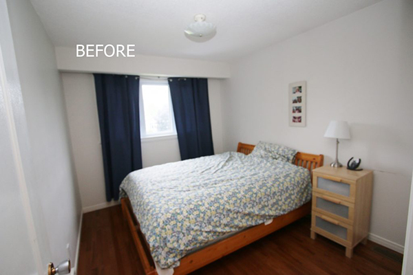
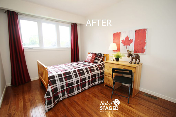
The big bed consumed this room so when we saw this single bed and desk in their basement storage, we decided to turn it into a younger child’s room. This was perfect, since it also gave the homeowners a queen bed in their other house to sleep on. As you walk in you also notice how nice the floors are. You want to capture the attention with a few fun pieces as buyers walk through each room, so each room is remembered. You might have noticed in previous blog posts that I’ve tried to put in one #Canada150 in each house this summer. 🙂
Sold!
The homeowners were very excited since they said their first offer was from a family with a young boy and a teen girl. We nailed our target market!
THE RESULTS
 |
 |
|
|---|---|---|
| Views on Realtor.ca | Facebook Reach | Direct Emails to Buyers |
349 |
372 |
345 |
 |
 |
|
| Showings | Asking Price vs Sale Price | Days on Market |
17 |
97.9% |
21 |


