ANOTHER STAGED HOUSE SOLD FIRST DAY
Sometimes when our team goes into a house, all it needs is some decluttering and then some fresh pops of colour through artwork and accessories.
We often use the seasons to influence colour choices when staging. In March, we are all done with the cold and dreary winter Ottawa weather (let’s pretend yesterday’s snow didn’t happen!). It’s time to lighten things up and inspire buyers.
Switching Artwork Around
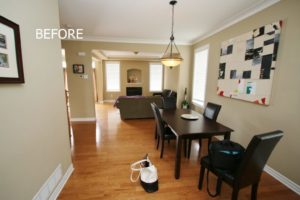
Our team really liked the homeowners’ large piece of artwork in the dining room. The problem was, we didn’t have anything in our inventory to carry the same colour scheme through the main floor. However, we were able to use it upstairs in the family room.
By bringing in the large light blue/cream/tan/white apple blossom artwork, we could incorporate the same colours elsewhere for a cohesive flow.

We added more artwork and accent cushions on the bench in the foyer.
Create Atmosphere

While still using all their furniture, we created a light and fresh space simply by adding more artwork, cushions and accessories.
Balance and Symmetry
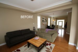
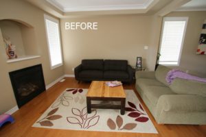
The new larger ivory area rug expands the space so the room feels larger. Even though the lamps are different, we used the same shades for some symmetry.
Less is More

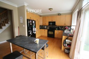
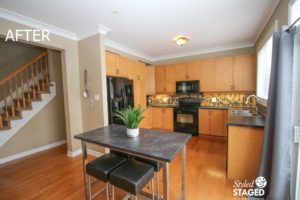
Remove all little storage charts in kitchens because it makes buyers think there isn’t enough storage. That is another reason why you want to keep your counters fairly cleared off.
We were able to add the same colour drapes as the artwork in the adjoining living/dining room. The drapes also pull the colour from the backsplash and their kitchen table. Our goal for our clients is to always make our inventory look like it belonged there in the first place.
Artwork Hung Too High

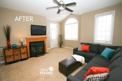
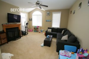
The homeowners had hung tiny pictures all along the top of the walls to hide nail holes of previous owners. That only draws attention to the flaws. Fortunately, our team convinced them to paint this room again so we had a fresh start. Recognize this great artwork from the dining room? This piece looks great in this family room and it allowed us to inject bold colours in cushions and accessories.
Even though this is a family home, it doesn’t need to have all the toys visible. Keep the space as versatile and clutter free as possible.
The fact that there are no other rooms on this level of the house allowed us to have fun with these colours.
Tie Two Rooms Together with Accessories

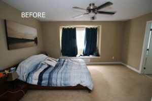
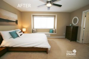
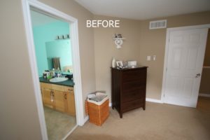
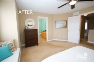
We were initially a bit confused with all the colours in the master and the en-suite. The bedroom felt dark and cozy and the en-suite was very bright turquoise but there was no flow. Since there wasn’t enough time to paint, we brought the same turquoise accent colour from the en-suite into the bedroom. We were inspired by the beach. Lots of sand, white and turquoise.

Moving the dresser to the other side of the room allowed us to open the double doors completely to make the room look even larger. The artwork also helped with our inspiration. Our team loved how the bench window was able to be showcased 😍 with cushions once the heavy drapes were removed. The window has nice wooden blinds for privacy so drapes were not necessary. Never leave laundry hampers out when staging, no matter how attractive they are.
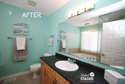
Adding artwork and accessories toned down the saturated wall colour.
Don’t Hide Windows
Almost every house our team goes into has at least one bed partially covering windows. That might be fine for your own living, but while our team is staging your home, you want to show what you’re selling. Nice windows are a huge selling feature.

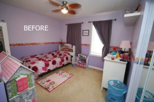
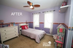
Staging a child’s room can often be very difficult. They don’t understand the changes and can get very overwhelmed so we try to make minimal changes but still have a big impact.
Moving the furniture around made a huge difference since it showcased the windows. We switched the heavy drapes with white sheers. Again, they had blinds.
Simply turning their comforter over to the plain underneath side, simplified the room. There was already so much to look at, we want buyers to see the size and shape of the room and not be distracted. Simple is better when staging.
This house sold the first day which made everyone’s hard work worthwhile!
👏 We are always happy when our clients work with our team for staging. The results always show! 👏
THE RESULTS
 |
 |
|
|---|---|---|
| Views on Realtor.ca | Facebook Reach | Direct Emails to Buyers |
655 |
2,851 |
631 |
 |
 |
|
| Showings | Asking Price vs Sale Price | Days on Market |
12 |
100.6% |
1 |


