DREAM STAGING
Our client had moved out of this stunning large home but left us a few pieces of furniture to work with. Our team had the challenge of creating a plan to figure out which furniture we needed to rent from the furniture rental store, and which accessories we needed to bring in from our inventory to make it feel like a home.
Huge Rooms
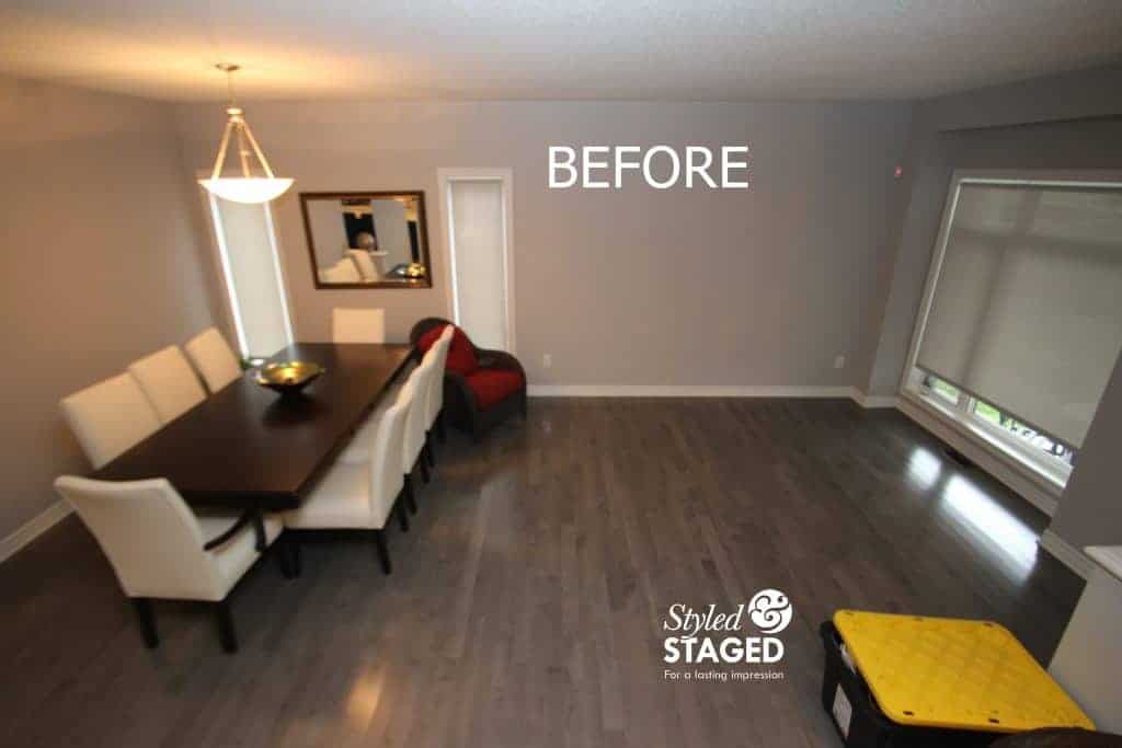
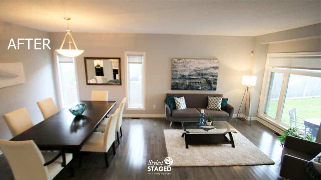
One of the hardest thing about renting furniture is that you don’t always get exactly what you want since their inventory is constantly changing. We completely understand that since our inventory is constantly rotating as well. It’s just the nature of the business but homeowners and Realtors need to be aware of that as well since it can mean delays in the listing. Last minute changes in the rentals also mean that your perfect plan can completely change your entire concept in a few moments. We always take extra inventory with us for that very reason. Always be prepared!!! We wanted to keep a modern yet elegant feel to the house to keep its integrity.
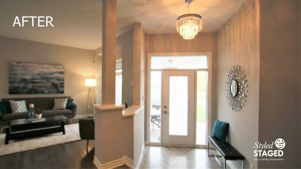
It was important to carry the same colour through to the entrance to make the room look wider. The pops of teal give the grey and white rooms a nice pop of colour.
A View From Above
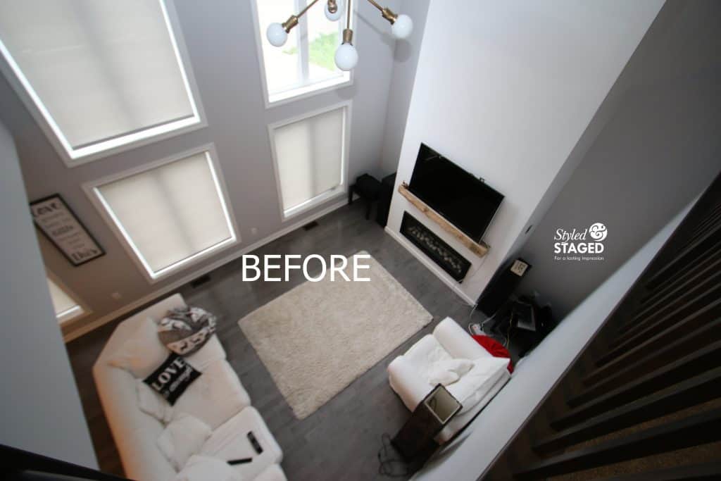
The best way to view this family room is from above standing in the loft. We could really see how we wanted to place furniture from this viewpoint. It was like at 3D software of a floor plan. The white chair was brought up to the loft since we wanted two matching chairs in this room.
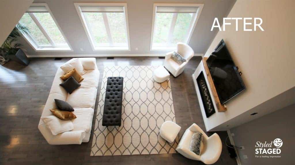
We knew we wanted to create symmetry and balance. We ordered two grey chairs since we didn’t want the room to be all white. At the last minute, they had to bring us two white chairs instead. We understand, these things happen and the store always takes care of us and our my clients. The white chairs worked out just fine because we brought down the grey bench from the master bedroom to use as a coffee table. The grey anchored the room. The larger area rug helped to define the space. Now the oversized and overstuffed sofa isn’t the dominating feature in the room.
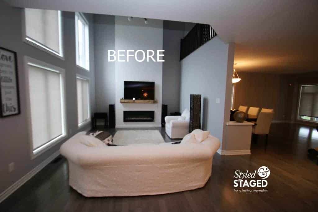
Right away we noticed the wood beam mantle on the fireplace and we wanted to showcase it since it was so beautiful.
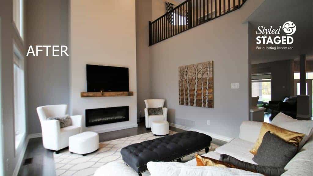
Our artwork tied the wood element into the room as well as the warmth from the gold velvet cushions.
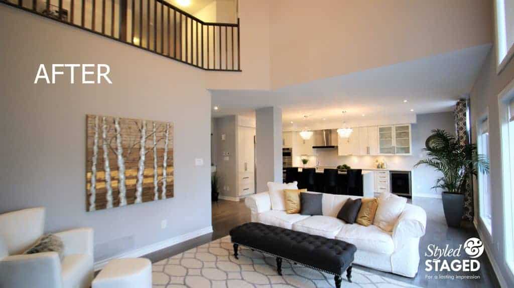
The gold and silver metallic foil in the artwork helps keep the room looking luxurious.
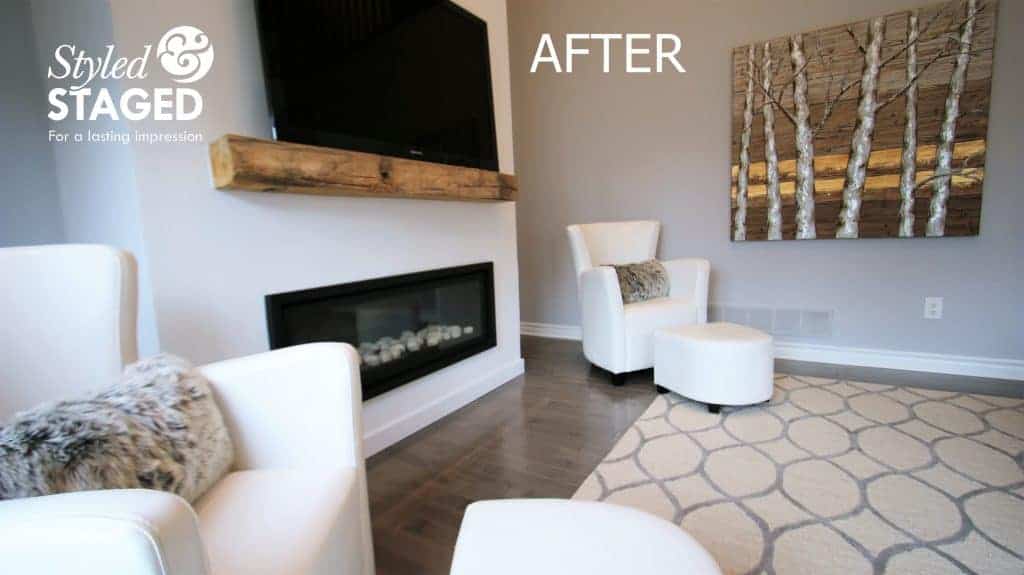
The faux fur cushions keep the room feeling cozy and comfortable but still elegant. The white leather chairs would have looked too cold without something on them.
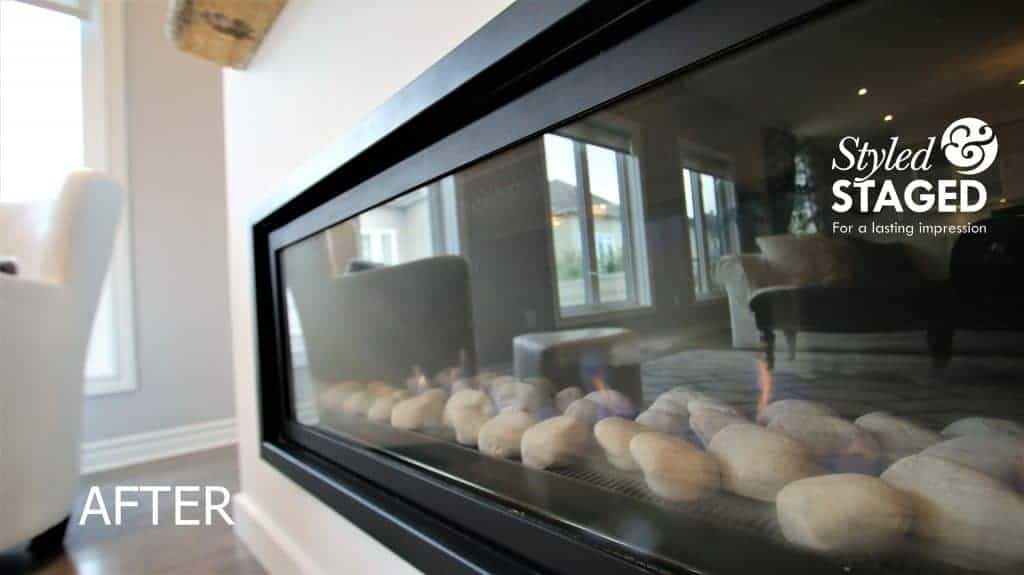
Just imagine sitting by this modern fireplace on a cold winter day/night.
Gourmet Kitchen
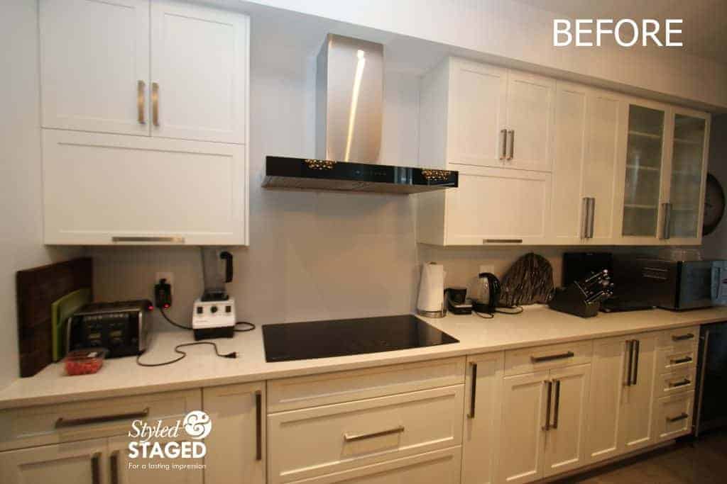
When your kitchen is visible from all angles of the house, it’s very important to remove items from the counter and display pretty accessories. This house has a huge pantry, so storage is NOT an issue.
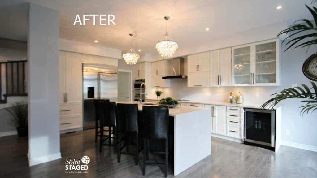
We brought in a lot of greenery for life and texture. Again, keep things simple but oversized for more impact.
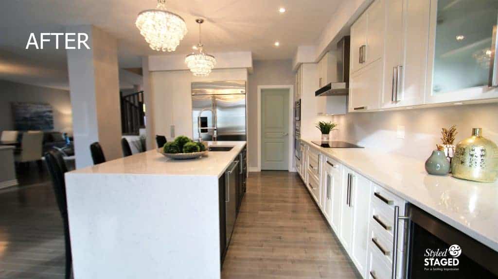
Once the ‘clutter’ is removed you really notice the two sparkly crystal light pendants above the island.
Lofty Ideas
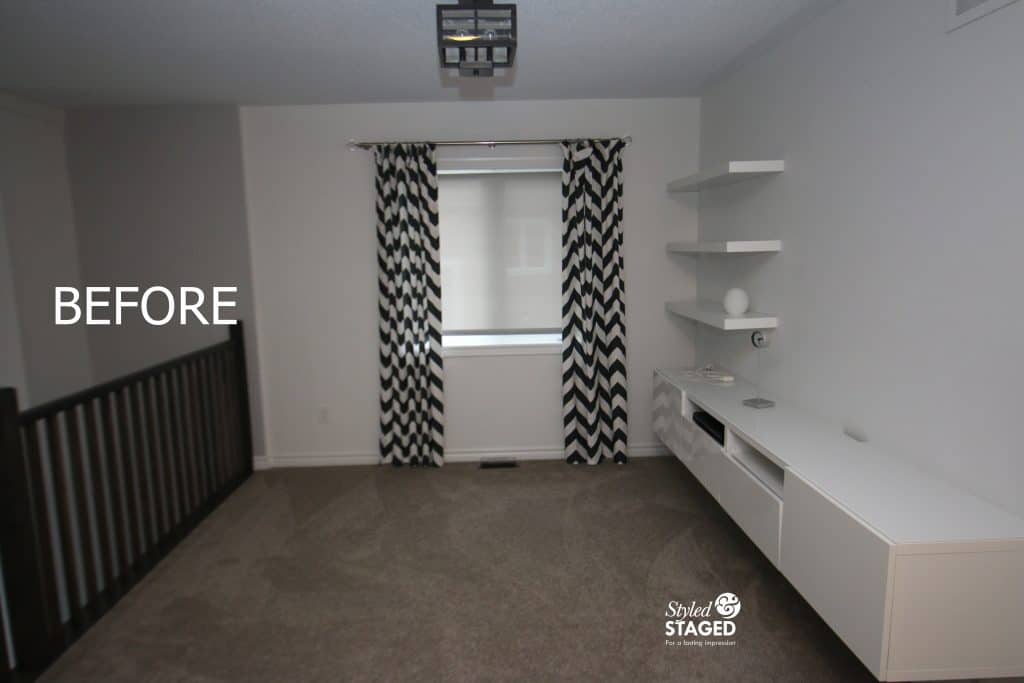
We were so excited seeing this empty space since it had so many possibilities for buyers. It’s right outside the master bedroom but it also overlooks the family room. It could be used as a sitting room, a TV lounge or a play area for the kids before bed. We always have to consider what we have to work with to showcase it the best way possible.
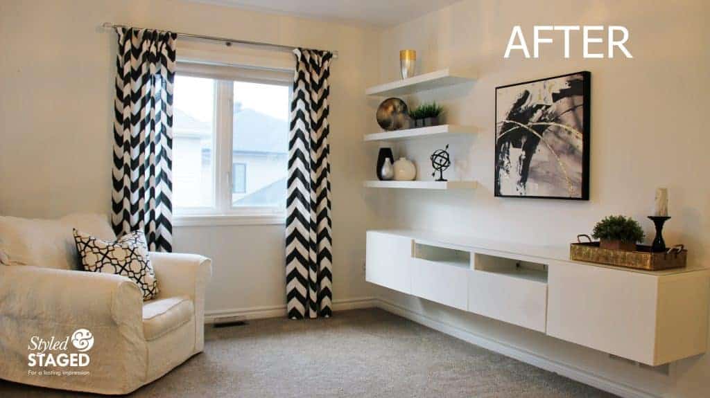
Remember the chair from the family room? By bringing it upstairs, we didn’t need to rent furniture for this area and it looks great since it’s so oversized. We didn’t have a TV but hanging artwork showed that you could put one there and it gives you a focal point. Using their drapes was a huge saver and they were perfect. We just brought in accessories to tie everything together.
Grouping smaller items on a tray is a great way to give everything more impact and presence.
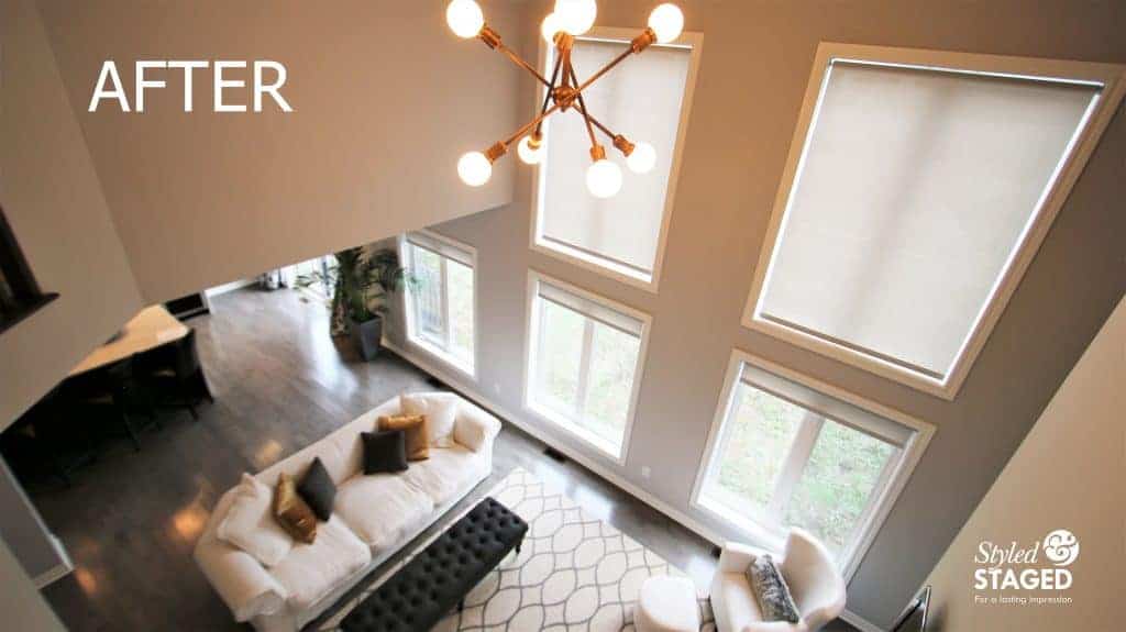
Since both rooms are so visible from each other, it was important to continue with the same colour flow.
Make sure you stay tuned for the next post showing the bedrooms and other staging/décor tips from this dream staging.
THE RESULTS
 |
 |
|
|---|---|---|
| Views on Realtor.ca | Facebook Reach | Direct Emails to Buyers |
482 |
624 |
498 |
 |
 |
|
| Showings | Asking Price vs Sale Price | Days on Market |
27 |
97.1% |
7 |
