MAJOR STAGING TRANSFORMATION
These homeowners really went the extra mile and were willing to do a lot of painting and also store some furniture that they wanted for their new larger home. Our team always tries to ask clients to do as little as possible for the biggest return but sometimes it pays off to go the extra mile. This is a perfect example of that.
Entrance
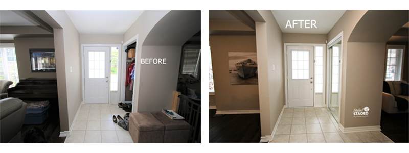
Sliding doors can be a nuisance on closets but buyers do like to see a tidy foyer as soon as they enter the house. You don’t want their eyes to stop at the shoes. You want them to visually expand into their potential new home.
Home Office
This very long and large room was originally intended as a dining room but since we didn’t have a dining room suite, we kept it as a home office/sitting area. The dark brown wall needed to be painted in the same colour as the rest of the room and more than half of the furniture needed to be stored.
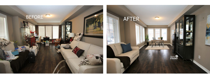
Notice how the ivory area rug not only lightens the space, but it also helps define the zones. The desk looked lost without it. Now that the far wall is the same colour, the room actually looks wider.
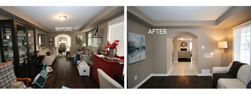
The round mirror in the distance mimics the round door frames. All these little tricks help draw your eye to the distance which makes space feel larger. Our staging team brought in a lot of neutral blue accessories to tie all the rooms on the main floor together. The curio now holds books that are more in keeping with an office and sitting room.
Living Room
We were happy that the homeowners were willing to paint all the dark brown walls the same colour as the other lighter walls. The room felt taller since the bulkhead was a contrast with the dark walls.
They also agreed to store their piano.

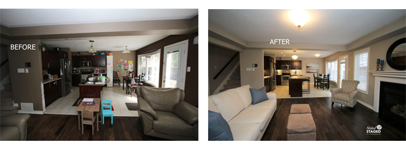
The leather chair and sofa were taken to the family room in the basement. We created symmetry by flanking the fireplace with the matching chairs. This fabric sofa was originally in the office. The fireplace becomes the focal point with the new larger accessories. The black round mirror ties in with the black surround.

We used their cube ottomans as a coffee table to help fill the large gap. Once the furniture was pulled into the room a bit, there was a better traffic flow and intimacy for conversation.
Kitchen
We immediately wanted the white storage cabinet removed. It screams that the homeowners didn’t have enough storage when in fact, there is a ton of cupboards. It was for all their craft supplies. The lighter walls really opened up the space and made it brighter.
Bringing in stools showcased the island. Since we turned the ‘official’ dining room into an office, we wanted to dress up this area for more formal eating as well. The large artwork elevates the look.
Principal Bedroom
When you have a bed in front of a window without a headboard it’s important to prop up several pillows to ‘create’ a headboard. This room basically just needed to be de-cluttered.
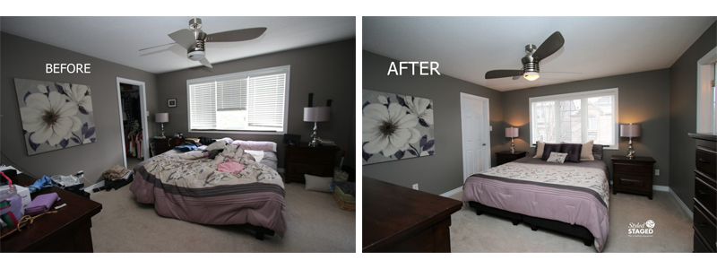
The attached dark mirror was a bit heavy for the room and it also reflected everything that was on the dresser. The dark filing cabinet in the corner was moved to the main floor office.

A new mirror and fewer accessories were all that was needed to create a relaxing retreat.
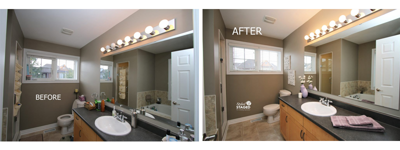
Always make sure all the light bulbs work and that they are the same colour. A few mauve and white accessories were brought in to show buyers that this bathroom is for the Principal bedroom. You always want a flow between these two rooms.
Work With The Colour
This room was full of charm, personality and colour. The teams staging linens and accessories worked with the existing colours but they weren’t as personal. Notice how the curtain rods, shelf and all the little decals were removed. The room was simplified without being boring.

Showcase Unique Features
The large cabinet on the left wall is actually a Murphy bed that is included with the sale of the house. This sofa was thrown out and the good leather sofa and chair from the living room were brought down here. We arranged the furniture so the Murphy bed can easily be showcased in both positions without having to rearrange anything. Make it as easy as possible for buyers to see the potential.
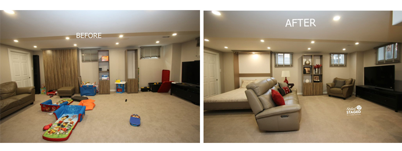
Pushing the wall units together and accessorizing them was another way of adding colour and a focal point as you entered the room. We used a console table and chair to create a work station instead of a toy station. Again, you always want to appeal to the masses.
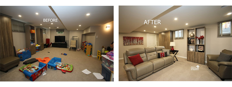
This very valuable space is no longer just a playroom. It’s an inviting space for the entire family. Since it has an adjoining full bathroom, it also makes a wonderful guest suite.
This house sold within a few days over asking price. We know there was a lot of work done, and our staging team truly believes the staging was worth it!
THE RESULTS
 |
 |
|
|---|---|---|
| Views on Realtor.ca | Facebook Reach | Direct Emails to Buyers |
1,922 |
2,921 |
746 |
 |
 |
|
| Showings | Asking Price vs Sale Price | Days on Market |
8 |
103.5% |
2 |
