WHERE TO START WHEN STAGING A HOUSE
This blog post is all about how to find your source of inspiration when staging a room.
When we first meet with a homeowner we need to instantly gain their trust because not everyone is on board with Staging at the beginning. Often our team suggests the staging, not the homeowners. While we gain their trust, we also scan the room to see where our ‘jumping off’ point is and figuring out what inventory we have in stock that would suit their house. We’re searching for the features of the home that we want to highlight and what needs to be repaired/painted etc. Every home tells a story so we also need to take into account the location, who the potential buyers are and the price point. There is a LOT to cover in the initial staging consultation.
Style Inspiration
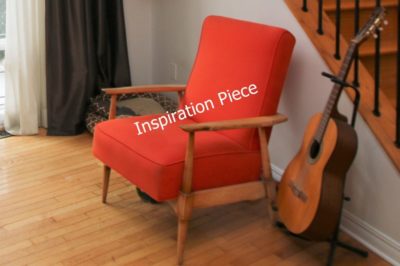
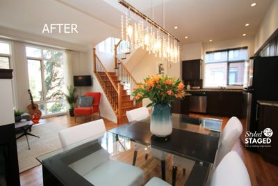
In this downtown condo, we really wanted to highlight the large windows and the fireplace since those features are staying. The clients were amazing and gave me the freedom to do whatever we wanted. The only real request was to somehow incorporate their mid-century orange chair. That instantly become our ‘style inspiration’. If the chair was the only orange item in the room, it would jump out too much and be a distraction instead of an asset. We carefully added little accents of orange around the open-concept living space.
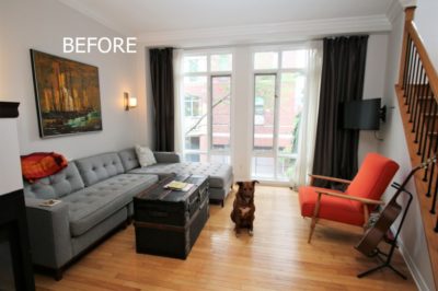
We wanted to highlight the grey furniture more than the brown drapes. Once they were removed, the window appeared larger and the room felt brighter. By removing the brown drapes, we could also add several shades of teals and blues for more interest. Orange and blue are opposite on the colour wheel so the two colours look great together. The neighbourhood is very hip so continuing with the mid-century look was the best way to go for sure because it would appeal to the buyers.
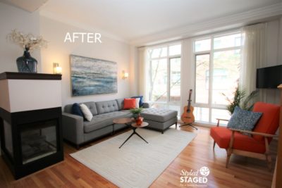
Even though the floors were completely refinished, we felt that it was still better to have an area rug in the living room to help define the space and add more layers of texture. There is so much wood everywhere else, so we weren’t worried about buyers not seeing the floor in this one space. The new three-tiered coffee table was the perfect piece for the size and feel of the room. It was also a great place to add more pops of colours.
Artwork Inspiration
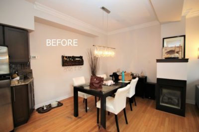
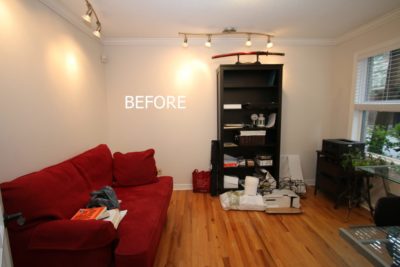
The dining room felt a bit heavy and cluttered with the buffet on the far wall. It also meant that the table couldn’t be centred under the light fixture. We loved the handcrafted wine rack on the wall but it was too rustic for the look we were going for.
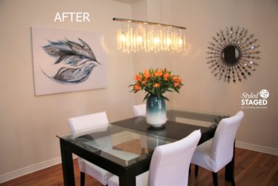
The starburst mirror and blue artwork complemented the living room décor. Bigger is better when it comes to staging so this large ceramic teal vase with the orange fresh flowers were the perfect finishing touch.
Highlight the Main Features
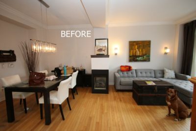
We wanted the fireplace to be a main feature. Sometimes keeping things simple, yet bold is the best Staging option.
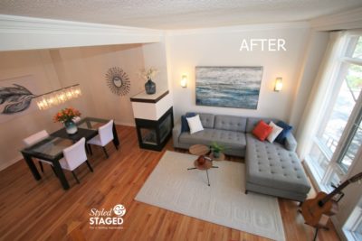
The blue glass jug on the fireplace makes it a focal point. Since it’s glass, it doesn’t feel too heavy either.
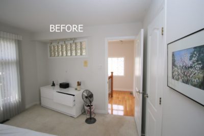
Work With The Fixed Elements for Your Inspiration
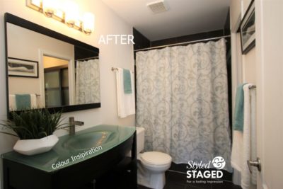
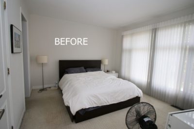
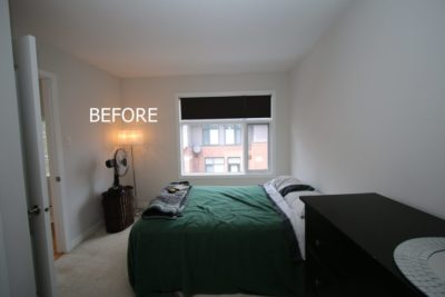
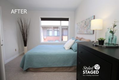
Upstairs there are two bedrooms with a bathroom between the two. Since both the vanity countertop and the glass closet doors were made from a frosted glass with a green undertone, we knew we wanted to make the green our accent colour in all three rooms.
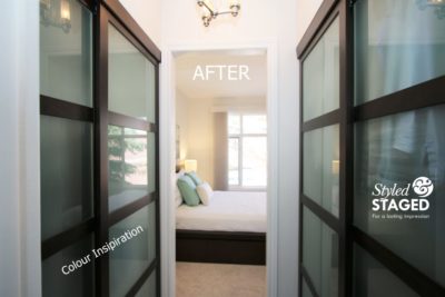
You can see how the closet is a walk-through to the master bedroom.
The artwork had just enough of the green shade to work with.
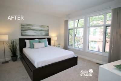
We still wanted to keep the room light and airy to enhance the large window. Incorporating more green glass on the night table is an easy way to mimic the bathroom vanity and the closet glass doors.
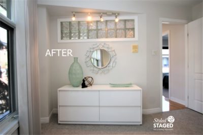
There is an outlet behind the mirror for a TV etc. but it didn’t look very nice for the photos. Again, we just kept the accessories oversized and in the same colour palette.
Bedroom #2
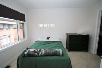
The second bedroom is also attached by the bathroom so we wanted to keep the same colour scheme but still make the rooms very different from each other. We didn’t want it to be confused with the master bedroom.
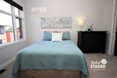
Although the colours are the same in both rooms, the linens and artwork made them look different.
Flooring Can Also Be An Inspiration
The colour of the tile just outside the office as you enter the house was my inspiration for the artwork in the office.
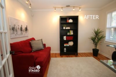
Bookshelves don’t need to be overflowing. It is, however, important to have something on them or it just looks like a dark hole.
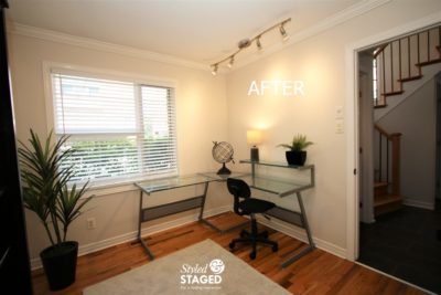
This room clearly shows that it can also be a guest room with a fold-out sofa and/or an inviting home office. We continued with the red accents in the powder room just outside the door for a continuous flow.
We’re sure this bright and modern condo will not be on the market for long. We can’t thank the homeowners enough for all their hard work refinishing the wood floors, replacing all the carpet, and removing everything from the house that we requested. This spotless house is completely move-in-ready for a lucky buyer.
THE RESULTS
 |
 |
|
|---|---|---|
| Views on Realtor.ca | Facebook Reach | Direct Emails to Buyers |
1,045 |
2,785 |
556 |
 |
 |
|
| Showings | Asking Price vs Sale Price | Days on Market |
18 |
100.8% |
14 |